Best Magnolia Home Moody Paint Colors of 2026
We’re absolutely thrilled to share the best moody paint colors of 2026 that are making waves in home design right now! After years of crisp whites and cool grays dominating our walls, the pendulum has swung dramatically toward rich, saturated colors that bring depth, warmth, and a whole lot of personality to our spaces. The moody color trend isn’t just continuing from last year – it’s evolving into something even more sophisticated and nuanced.

Why Moody Colors Are Dominating 2026
This year’s color trends reflect a collective desire for authenticity, comfort, and spaces that feel genuinely lived-in. Major paint brands from Benjamin Moore to Sherwin-Williams are leaning into deep, earthy tones that ground us and make our homes feel like cozy sanctuaries. These aren’t the overwhelming dark rooms of decades past – instead, designers are using moody hues strategically to create focal points, add dimension, and bring a sense of luxury without sacrificing livability.
The beauty of 2026’s moody palette is its versatility. Whether you’re painting kitchen cabinets, creating a dramatic accent wall, or transforming an entire bedroom, these colors work beautifully in both small doses and bold applications. Plus, they pair gorgeously with natural materials, warm metals, and the lighter neutrals that balance out their intensity.
Now let’s dive into the best moody paint colors trending in 2026, organized by color family to give you the full spectrum of what’s hot right now.
This post may contain affiliate links and is a member of the Amazon Services LLC Associates Program. If you make a purchase using one of these affiliate or Amazon links, I may receive compensation at no extra cost to you.
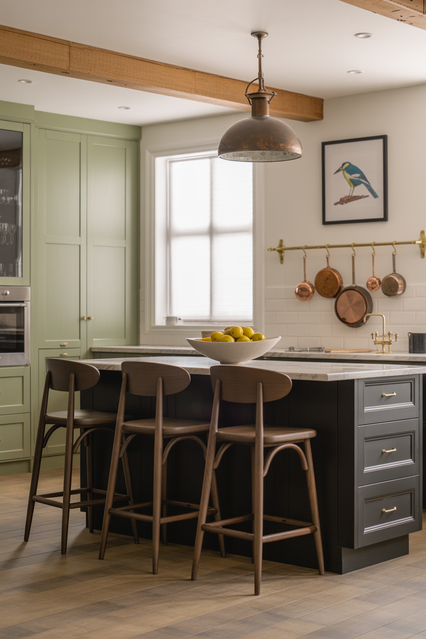
Moody Greens – The Earthy Anchors
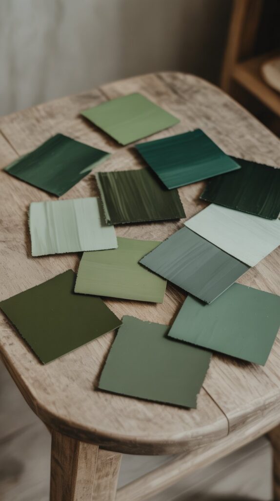
Green continues to reign supreme in 2026, but we’re seeing a shift toward muddier, more complex shades that feel grounded and organic. These aren’t your bright emeralds – think forest floors, mossy rocks, and smoky jades.
- Hidden Gem by Behr: Behr’s 2026 Color of the Year is a richly saturated blue-green with a touch of smoke that tempers its boldness. The warm undertones keep it livable while maintaining that elegant, moody edge.
- Shade Grown by Sherwin Williams (SW 6188): This deep, foresty green with brown undertones is perfect for creating intimate spaces without overwhelming them. It’s especially stunning in home offices and reading nooks.
- Warm Eucalyptus by Valspar: A muted, earthy gray-green that brings restful energy to any space. This color embodies the “restful neutral” concept that’s defining 2026.
- Pewter Green by Sherwin Williams (SW 6208): A cool, sage-like green with gray undertones that’s become wildly popular on kitchen cabinets. It offers sophistication with staying power.
- Backwoods by Benjamin Moore (CC 630): A welcoming, warm forest green with true black undertones that creates instant coziness in dining rooms and bedrooms.
Our Pick
TIMELESS COLORS PERSONALLY CRAFTED BY JOANNA GAINES: 1905 Green – A slightly jeweled forest green hue that brings sophistication to any room
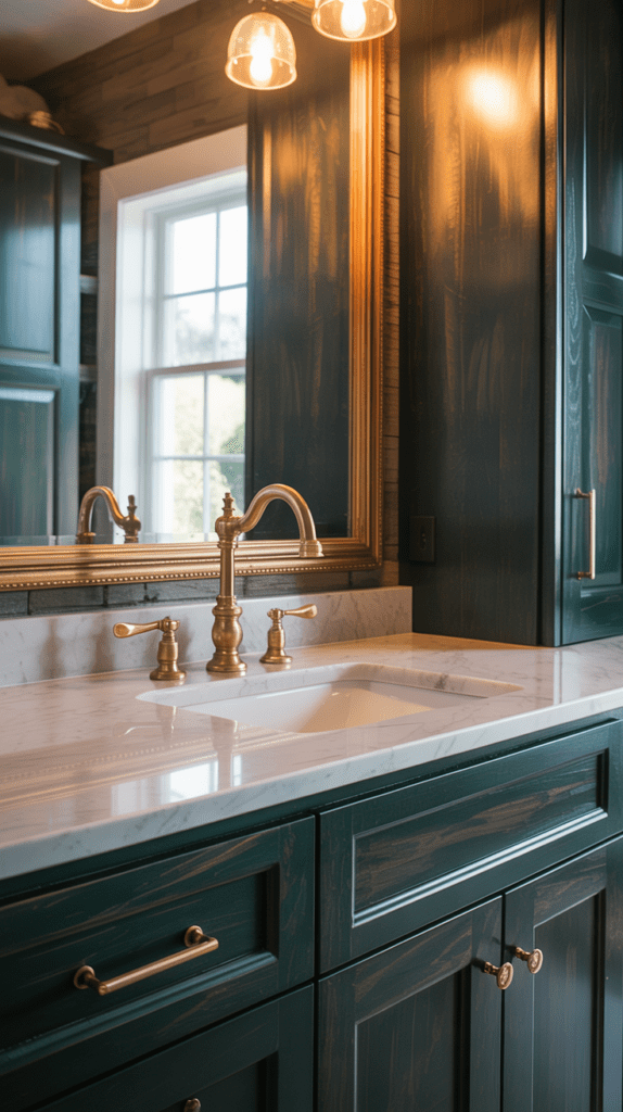
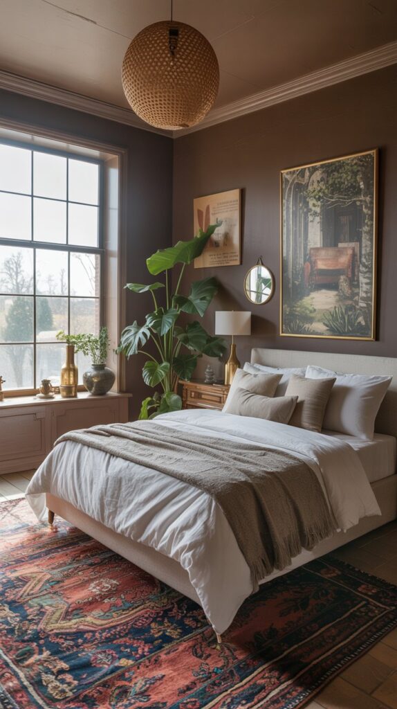
Moody Browns & Taupes – The Warm Revival
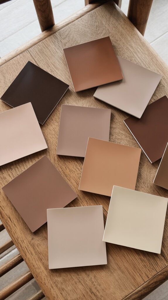
Brown is officially back, and it’s better than ever! The 2026 take on brown skews sophisticated and layered, with colors that shift between brown and gray depending on the light.
- Silhouette by Benjamin Moore (AF-655): Benjamin Moore’s 2026 Color of the Year weaves luxurious burnt umber with delicate charcoal undertones. This is the color that signals brown’s triumphant return to the spotlight.
- Universal Khaki by Sherwin Williams: This warm, grounded taupe-brown provides comfort and stability. It’s the perfect bridge between cool grays and true browns.
- Mocha Brown by Benjamin Moore (2107-20): Resembles a dark chocolate bar and creates instant drama in powder rooms and dining spaces.
- Anonymous by Sherwin Williams (SW 7046): This sophisticated hue shifts playfully between brown and gray, responding to lighting and creating a dynamic, layered look.
- Townsend Harbor Brown by Benjamin Moore: A chocolate brown that adds depth without feeling heavy, perfect for spaces that need warmth and dimension.
Our Pick
A gorgeous moody brown color that brings instant elegance and warmth to any space!
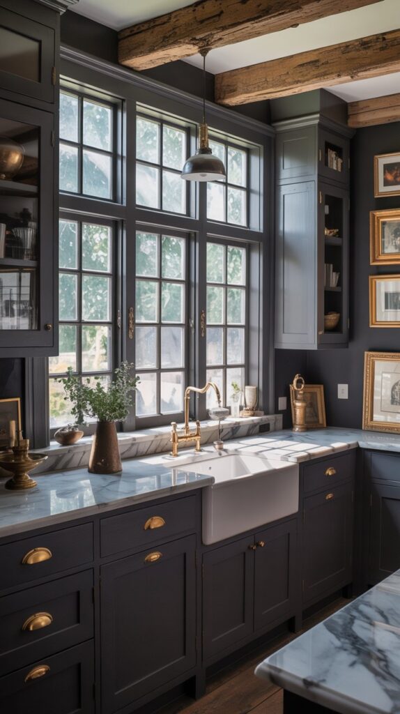
Moody Blacks & Near-Blacks – The Bold Statements
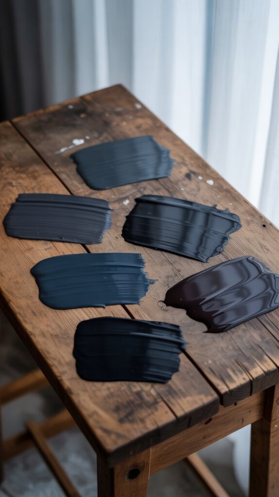
True black and near-black shades are having a major moment in 2026, offering the ultimate in drama and sophistication.
- Tricorn Black by Sherwin Williams (SW 6258): A true black with no obvious undertones – incredibly versatile for trim, cabinetry, and accent walls.
- Charleston Green by Sherwin Williams (DCR099): Appears almost black but has distinctive green undertones. Perfect for exterior doors and dramatic interior moments.
- Black Beauty by Benjamin Moore (2128-10): A rich, warm black with a brown base that feels less stark than true black.
- Jack Black by Little Greene: Adds a touch of modernity wherever it’s applied, particularly stunning in butler’s pantries and powder rooms.
- Black Magic by Sherwin Williams (SW 6991): A warm black that creates spa-like sophistication in bathrooms.
Our Pick
A stunning soft black that’s bold yet neutral – perfect for creating sophisticated contrast!
Moody Blues & Teals – The Serene Sophisticates
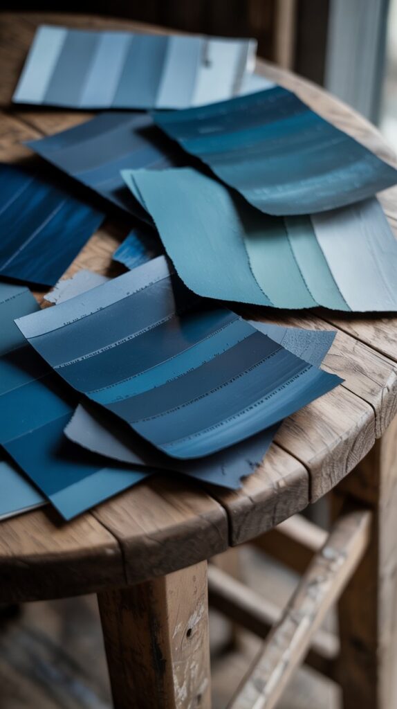
Blue remains a favorite in 2026, but the shades are deeper, richer, and more complex than the icy blues of recent years.
- Cool Blue by Pinterest: A pale, glacial shade with subtle blue undertones. Pinterest’s 2026 forecast shows this color trending up significantly.
- Hague Blue by Farrow & Ball: A deep, rich blue that makes living rooms feel inviting and warm despite its saturated hue.
- Transformative Teal by WGSN: Named the 2026 color of the year by this international trend forecasting company, it represents a move toward complex blue-greens.
- Mare Island by Portola Paints: An electric blue-green that brings fresh, tropical energy to powder rooms and accent spaces.
- Blue Nova by Benjamin Moore: A darker blue-gray that adds expressive color to bedrooms and offices.
Our Pick
A gorgeous moody blue with hints of gray that creates the dreamiest atmosphere!
Moody Grays – The Sophisticated Neutrals
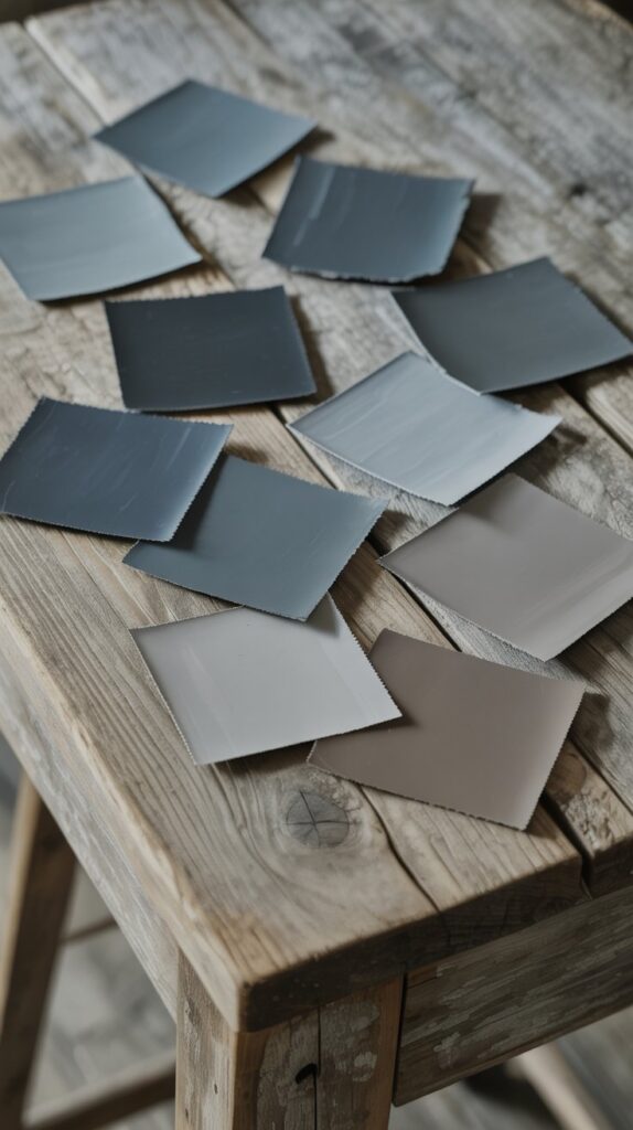
Don’t count gray out just yet! In 2026, we’re seeing a return to sophisticated grays with warmer, deeper undertones.
- Chelsea Gray by Benjamin Moore: A rich, deep gray that provides statement-making impact without overwhelming the space.
- Peppercorn by Sherwin Williams (SW 7674): A warm, charcoal gray with earthy undertones ideal for creating cozy, inviting atmospheres.
- Down Pipe by Farrow & Ball: A lead gray with blue undertones that gives unique depth to moody aesthetics.
- Gray Owl by Benjamin Moore (OC-52): A soft, light gray with warm, versatile hues perfect for balancing darker elements.
- Ammonite by Farrow & Ball: A light gray with subtle beige hints that adds warmth while maintaining sophisticated neutrality.
Our Pick
A gorgeous moody gray that works beautifully in any room of your home!
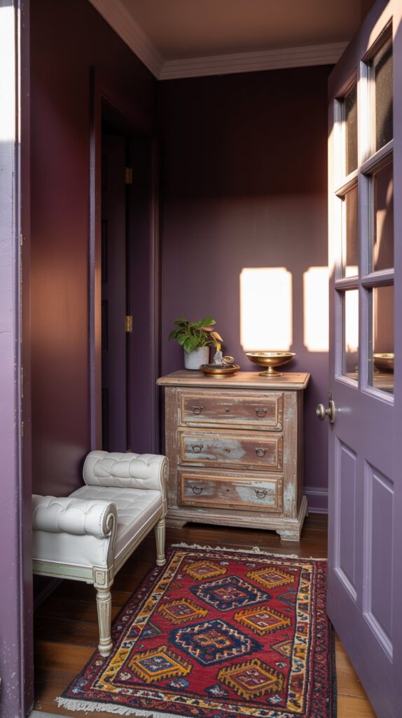
Deep Plums & Wine Tones – The Jewel Box Colors

One of 2026’s biggest surprises is the emergence of deep plums and wine-inspired hues that bring richness and luxury to interiors.
- Divine Damson by Graham & Brown: This deep plum with dark cherry tones is Graham & Brown’s 2026 Color of the Year, representing the continuation of moody jewel tones.
- Plum Noir by Pinterest: Pinterest’s forecast shows this moody plum trending up significantly, perfect for home offices and bars.
- Dinner Party by Benjamin Moore: A moody red reminiscent of fine wine that makes dining rooms feel sumptuous and sophisticated.
- Warm Mahogany by Glidden: A sumptuous red-orange softened by earthy brown undertones, perfect for intimate bedrooms and cozy kitchens.
- Purple Basil by Valspar: Carried over from 2025, this dark, saturated warm tone continues to resonate with homeowners seeking drama.
**Note on Magnolia Home:** While Joanna Gaines’ Magnolia Home paint line offers an incredible range of neutrals, greens, and farmhouse colors, it doesn’t currently feature deep plums or burgundy tones in their collection. Their aesthetic leans toward softer, more neutral palettes – which is why we’re recommending alternative brands for this dramatic color category!
Our Pick
A sophisticated plum shade with gentle depth in a beautiful eggshell finish. This paint and primer combo offers one-coat coverage, is stain and scrub resistant, low VOC, low odor, and perfect for creating moody yet elegant dining rooms, home offices, or accent walls. Made in the USA with eco-friendly materials.
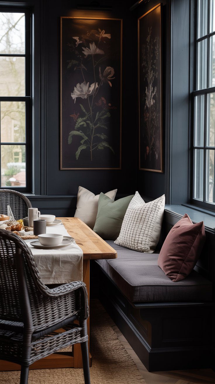
Best Rooms To Paint a Moody Color
Living Rooms: Moody colors create sophisticated backdrops for entertaining. Dark walls make spaces feel intimate and cozy, perfect for both gatherings and quiet evenings.
Bedrooms: These colors contribute to restful, serene environments. Darker shades make bedrooms feel like cozy retreats, ideal for unwinding.
Bathrooms: Transform bathrooms into spa-like sanctuaries. Darker tones add depth and luxury, making daily routines feel special.
Dining Rooms: Moody hues set the scene for memorable meals. They add drama and elegance that enhance the dining experience.
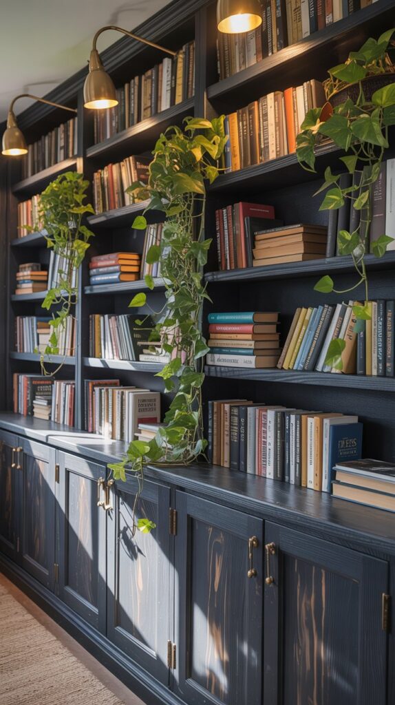
Home Offices: Define your workspace as separate from the rest of the home. Darker shades encourage focus and productivity while creating a distinguished atmosphere.
Kitchens: Particularly on cabinetry, moody colors add sophistication and timeless appeal. They pair beautifully with lighter countertops and backsplashes.
How to Work with Moody Colors in 2026
Balancing Light and Dark
The key to successfully using moody colors in 2026 is balance. Pair darker walls with lighter furnishings, artwork, and accents to create contrast and prevent rooms from feeling closed in. Mirrors and metallic elements (gold, brass, and bronze are particularly on-trend) reflect light and add brightness to spaces with darker walls.
Lighting Considerations
Both natural and artificial lighting significantly affect how moody colors appear. Rooms with abundant natural light can handle darker, more saturated moods. Spaces with limited natural light benefit from moody colors with warmer undertones or strategic use on accent walls rather than all four walls.
Texture and Finish
The paint finish impacts the overall effect. Matte finishes absorb light, giving walls a softer, more enveloping appearance – perfect for bedrooms. Satin and semi-gloss finishes reflect more light, adding vibrancy and depth – ideal for high-traffic areas like kitchens and bathrooms.
Layering Moody Colors
Don’t be afraid to layer multiple moody colors in the same space. Pairing Silhouette (a smoky brown) with Hidden Gem (a jade green) creates harmony and sophistication. The key is maintaining enough contrast and variety to keep spaces feeling dynamic.
The 2026 Approach: Grounded Sophistication
What makes 2026’s moody color trend different from previous dark color trends is the emphasis on warmth and livability. These colors are grounded, earthy, and feel connected to nature. They’re meant to create spaces that nurture and restore us, not just make visual statements.
Incorporating Moody Colors with Current Trends
Biophilic Design Connection
Many 2026 moody colors connect directly to biophilic design principles. Forest greens, earthy browns, and smoky blues bring the outside in, creating spaces that feel naturally grounded and restorative.
The Neutral Redefined
2026 is redefining what “neutral” means. Colors like Warm Eucalyptus and Universal Khaki prove that neutrals don’t have to be colorless – they can be inviting, calming, and grounding while still having personality.
Layering with Lighter Tones
The 2026 trend encourages layering – stacking bold moody tones with delicate pastels or grounding rich colors with ethereal neutrals. This creates interiors that feel calm and elegant yet richly dimensional.
Why These Moody Colors Will Stand the Test of Time
Unlike trendy colors that feel dated within a few years, the moody palette of 2026 draws from timeless classics and heritage colors. These are shades that have appeared in European interiors for centuries, in nature year-round, and in quality materials like walnut wood, leather, and stone.
They’re also incredibly versatile. A room painted in Conservatory or Coffee Nook can evolve through different decor styles simply by changing accessories, textiles, and furniture. The wall color provides a sophisticated backdrop that adapts rather than dictates.
These moody colors align with the growing “anti-trend” movement where people choose colors that reflect personal identity and comfort rather than fleeting fashion. They’re about creating homes that feel authentically yours and stand the test of time.
Whether you’re ready to dive into a full room transformation or just want to test the waters with an accent wall, these moody paint colors of 2026 offer incredible opportunities to bring depth, warmth, and sophistication to your home.